26.02.2020
The data set I picked was “Students in Faculties”.
 |
| Network |
 |
| Contribution |
 |
| Information |
Colour Palettes:
01.03.2020
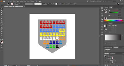
Creating the pictograph to represent the number of students each faculty.
Next, the group had a discussion on what colours to use. By choosing to combine our palettes, we could ensure that our individual palettes shared a few colours to make it more cohesive.


Comments
Post a Comment