TALKING WITH LIGHT
Video Presentation
Introduction - Written Statement
Light is fundamental to defining and influencing one's experience of a space. However, how do you increase the access of light whilst also dealing with privacy?
The room I studied operates as both a sleeping and studying space, but is overlooked by a neighbouring house. Thus, in my project “Talking with Light”, I aim to utilise shadow and light to communicate the private areas (sleeping) and public areas (studying) of the room.
A majority of photos are presented in black and white to further emphasise the concept of light and dark, without the distractions of colour.
Throughout the project, I experimented with screens, facade skins, orientation and openings
to achieve my aim.
Original Room Plan and Section 1:20
Diagram of my House
Model 1 - Chamfered Light
Concept Drawings
Photo 1 (1:20)
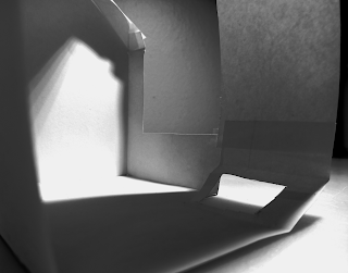
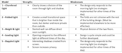
The first model studies the program in relation to light. Thus, the upper chamfered window allows direct light to the study space, whilst a low chamfered window allows reflected light into the sleeping space. The brightness of light defines the program of the space without physically dividing the room.
Model 2 - Folded Light
Concept Drawings
Photo 2 (1:20)
Photo 3 (1:20)
Leaning against the wall, the geometric curve of the folded screen creates a small transitional space that is between inside and outside. The difference of transparency in paper and cardboard also affects the brightness of light in the space, informing me of the effects of materials in this study.
Model 3 - Height & Light
Concept Drawing
Photo 4 (1:50)
Photo 5 (1:50)
This model experimented with the elements of double heights and skylights. The tall, slanted wall is able to use its angle and distance to diffuse the direct noon light, creating a gentle gradient that fades as the light travels to the lower floor (Photo 4). Due to the sleeping and studying spaces being separated by a level, the upper floor can be much more open to light without disturbing the lower floor (Photo 5)
Model 4 - Leading Light
Concept Drawing
Photo 6 (1:50)
Photo 7 (1:50) - Morning
Photo 8 (1:50) - Afternoon
Photo 9 (1:50) - Evening
Model 5 - Dappled Light
Concept Drawings
 |
| Photo 10 (1:20) |
Photo 11 (1:20)
Photo 12 (1:20)
Photo 13 (1:20)
Taking inspiration from the tree in my backyard, the organic pattern of the tree-like screen helps filter the light as well as act as a privacy screen. Photo 6 shows the shadow effect of the screen and how it also makes a space more interesting than compared to Photo 11, which is without the screen.
Conclusion
Refined Iterative Model
For the refined iterative model, I tried to create a model that incorporated the strengths of the previous exploration models, and improve upon the weaknesses identified. The main ideas I focused on were:
- The chamfered windows and idea of using light and shadow to separate space from Model 1.
- The slanted wall to diffuse a skylight light in Model 3.
- The idea of playing with time, shadow and light, thus creating movement in the space in Model 4.
- The organic facade from Model 5 and its narrative concept of bringing nature indoors.
- In Model 2 I realised that the form language of the folded screen and room are too different and not cohesive. This made me set a requirement for myself where screen facade should be continuous and cohesive with the rest of the building.
Photo 14 (1:20)
Photo 15 (1:20)
Photo 16 (1:20) - Early Morning Light
Photo 17 (1:20) - Mid Morning Light
Photo 18 (1:20) - Afternoon Light
Photo 19 (1:20) - Evening Light
Photo 20
The culmination of the previous reflections led me to this design.
The morning sun lights up the study side of the room while the sleeping side has a low light coming from the chamfered window. The afternoon light stretches the screen pattern over the slanted wall, generating equal light and shadow around the room. In the evening, the room has dimmed, and the dappled shadow almost seems to connect with the screen through the window.
The organic façade wraps around the openings to form a continuous feature as well as giving the feeling of being surrounded by a forest.
Overall, the design was able to meet the aims I set out at the beginning and through the explorative models I was able to learn and test different concepts which helped in giving direction to the development of the refined model.


Comments
Post a Comment